Content
What are Top Actions ?
Top Actions allow you to add settings to your SharePoint Framework (SPFx) web part just like you would do on the property pane but directly on the web part’s command bar.
Top Actions were introduced in the SPFx v1.16 release (preview). In this blog post we will talk about how to use this feature with the SPFx v1.17.1 release (there are a few differences).
You can choose from two different user interfaces for your top action:
- Button
- Dropdown list
How to use it ?
Add Top Action to your web part
To add top actions to your web part, you must implement the getTopActionsConfiguration() method which return ITopAction object:
import { ITopActions } from '@microsoft/sp-top-actions';

export default class HelloWorldWebPart extends BaseClientSideWebPart<IHelloWorldWebPartProps> {

  public getTopActionsConfiguration(): ITopActions | undefined {
    return {
      topActions: [], //List of top action controls you want to add to your web part
      onExecute: (actionName: string, newValue: any) => {} // Method triggered when you select one of the top action
    };
  }
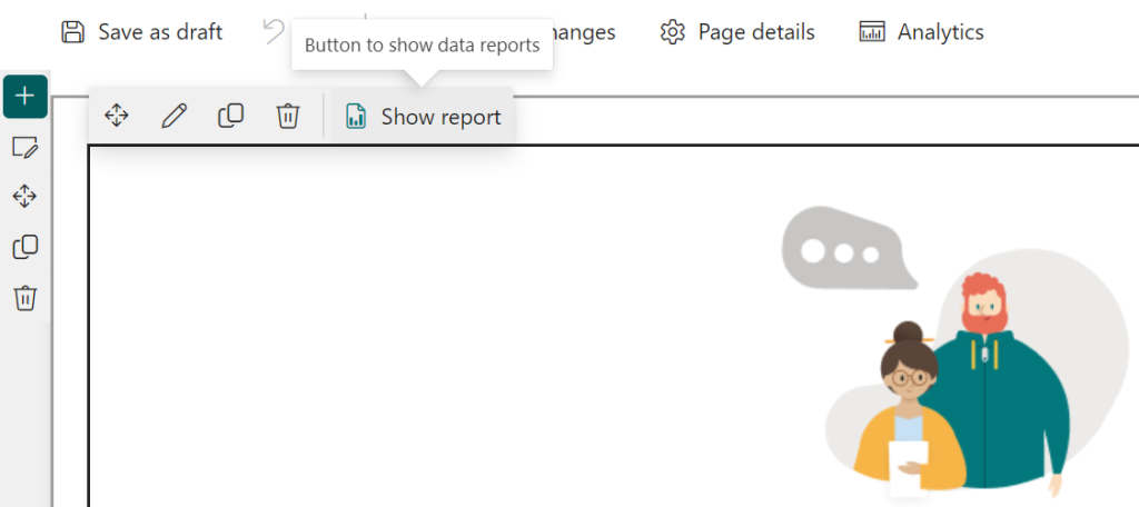
Use button control
To define a button control (TopActionsFieldType.Button) define the following properties in topActions:
import { ITopActions, TopActionsFieldType } from '@microsoft/sp-top-actions';

export default class HelloWorldWebPart extends BaseClientSideWebPart<IHelloWorldWebPartProps> {

  public getTopActionsConfiguration(): ITopActions | undefined {
    return {
      topActions: [
        {
          targetProperty: 'button', // Target property from the web part’s property bag
          type: TopActionsFieldType.Button,
          title: 'Button to show data reports', // Display name of the action (can be used in a tooltip or aria-label)
          properties: {
            text: 'Show report',
            icon: 'ReportDocument'
          }
        }
      ],
      onExecute: (actionName: string, newValue: any) => {
        console.log(actionName); // value of the targetProperty ('button' in this example)
        console.log(newValue); // true (always the same value for button controls)
      }
    };
  }
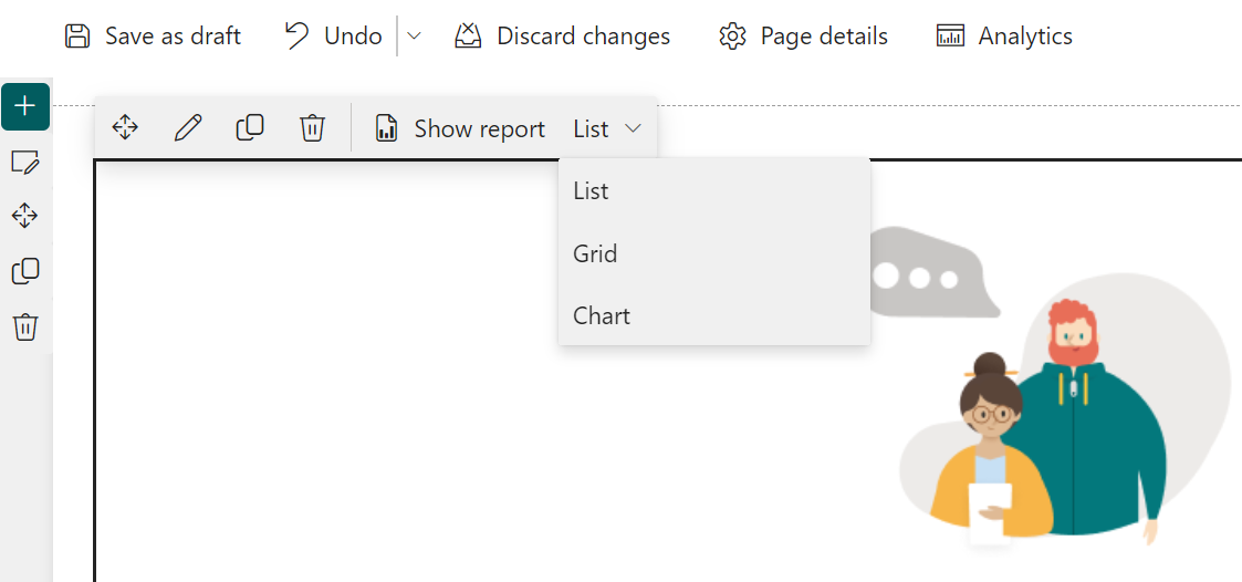
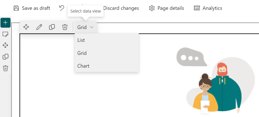
Use dropdown list control
To define a button control (TopActionsFieldType.Dropdown) define the following properties in topActions:
import { ITopActions, TopActionsFieldType } from '@microsoft/sp-top-actions';

export default class HelloWorldWebPart extends BaseClientSideWebPart<IHelloWorldWebPartProps> {

  public getTopActionsConfiguration(): ITopActions | undefined {
    return {
      topActions: [
        {
          type: TopActionsFieldType.Dropdown,
          title: 'Select data view', // Display name of the action (can be used in a tooltip or aria-label)
          targetProperty: 'displayMode', // Target property from the web part’s property bag
          properties: {
            options: [{
              key: 'list',
              text: 'List',
              checked: this.properties.displayMode === "list"
            }, {
              key: 'grid',
              text: 'Grid',
              checked: this.properties.displayMode === "grid"
            },
            {
              key: 'chart',
              text: 'Chart',
              checked: this.properties.displayMode === "chart"
            }]
          }
        }
      ],
      onExecute: (actionName: string, newValue: any) => {
        console.log(actionName); // value of the targetProperty ('displayMode' in this example)
        console.log(newValue); // value of the key of the selected option (e.g. : '2' if Grid is selected)
        this.properties.displayMode = newValue;
      }
    };
  }
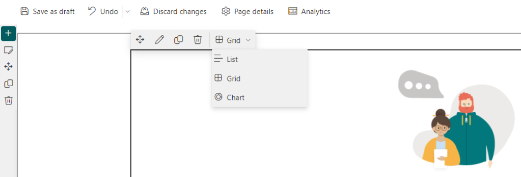
What about icons for dropdown options ?
You can also add an icon for each option available in the dropdown control using iconProps:
properties: {
            options: [{
              key: 'list',
              text: 'List',
              checked: this.properties.displayMode === "list",
              iconProps: {
                officeFabricIconFontName: "List"
              }
            }, {
              key: 'grid',
              text: 'Grid',
              checked: this.properties.displayMode === "grid",
              iconProps: {
                officeFabricIconFontName: "GridViewMedium"
              }
            },
            {
              key: 'chart',
              text: 'Chart',
              checked: this.properties.displayMode === "chart",
              iconProps: {
                officeFabricIconFontName: "DonutChart"
              }
            }]
          }
Working sample of code
If you want to try out Top Actions by yourself you can find a small web part sample that I built here: react-graph-webpart-report
 Aimery Thomas' blog