This blog post is the second part of Viva Connections Card Designer – Advance API features (part 1).
It will focus on using the Microsoft Graph API and the Card Designer advance API features to display dynamic data within a Viva Connections dashboard card without code.
Content
Prerequisites
The same prerequisites described in the part 1 should be met. In addition, the use of the Microsoft Graph API requires the following prerequisites.
SharePoint Online Client Extensibility Web Application Principal
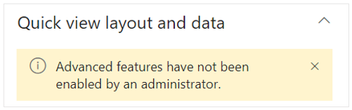
On the Card Designer card settings, if you try to execute a Graph API request (using the “Test” button), you will have the following error message: Cannot make any requests to Microsoft Graph as the SharePoint Online Client Extensibility Web Application Principal is not configured or consented to.
It means that the SharePoint Online Client Extensibility Web Application Principal might not be created. This app is used to manage permissions that your Graph API requests require. This app is also the one managing permissions for SPFx solutions.
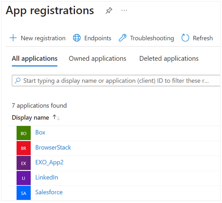
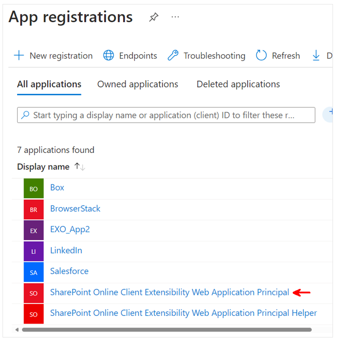
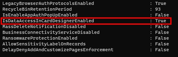
To check if this app has already been created, you can go to the Microsoft Entra admin center and check the “App registration” list:
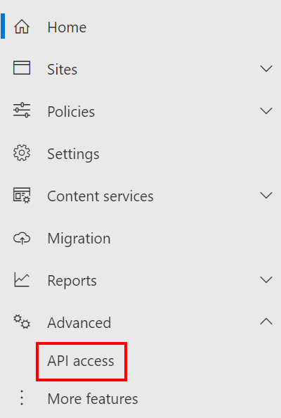
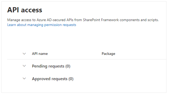
To create this app, access the “API access” page from your tenant’s SharePoint admin center. :
If you check again the “App registration” page, the app is listed:
Add required permissions
Now that the SharePoint Online Client Extensibility Web Application Principal is created, we need to add permissions that are required for the API call we want to perform from the Card Designer.
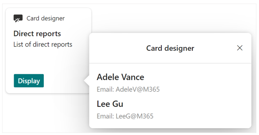
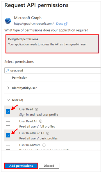
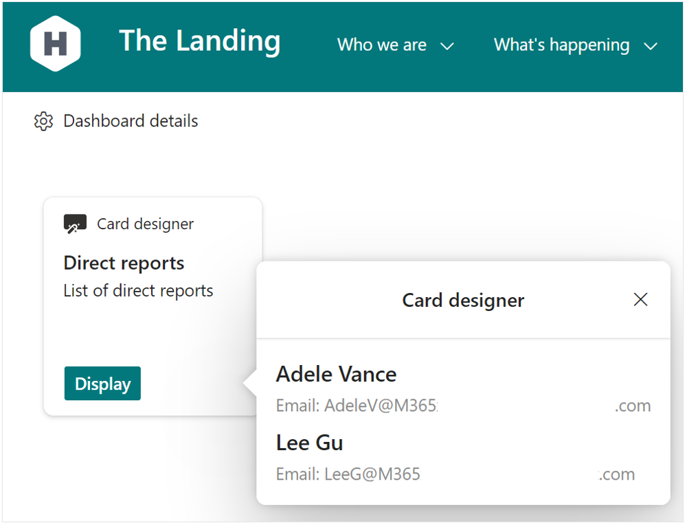
In our example we want to get current user’s direct reports. So we will need at least the User.Read and User.ReadBasic.All permissions:
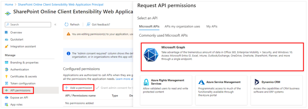
- On the SharePoint Online Client Extensibility Web Application Principal page, click on “API permissions”
- Click on “Add a permission”
- Select “Microsoft Graph” then “Delegated permissions”
- Select the “User.Read” and “User.ReadBasic.All” permissions then click on “Add permissions”
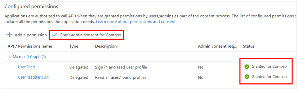
Finally, as an admin you must grant consent for the newly added permissions:
Get data using Microsoft Graph API
Once all the prerequisites are met, you can start using the Microsoft Graph API to get data from the Card Designer.
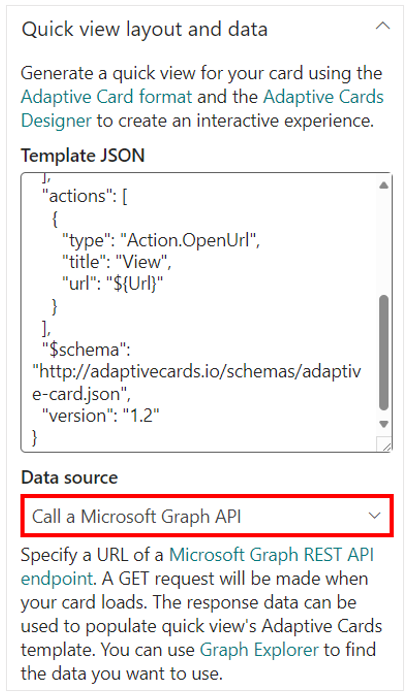
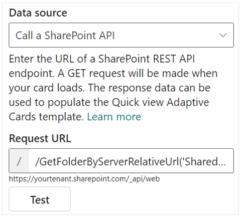
First, add a new Card Designer card to the Viva Connections Dashboard and select Call a Microsoft Graph API in the Data source dropdown:
Then you can write your request URL in the input field that appeared below. As an example, we want to get current user’s direct reports: v1.0/me/directReports
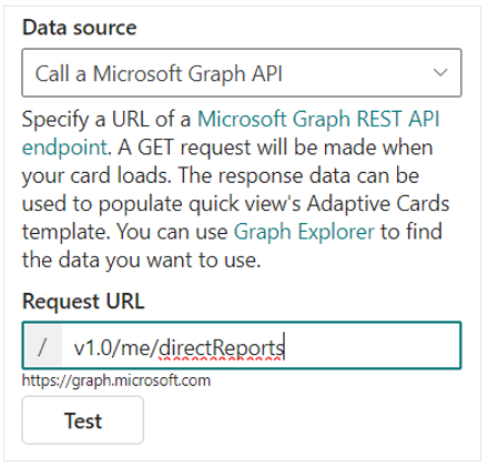
You can click on “Test” to preview the response of the request.
Display data
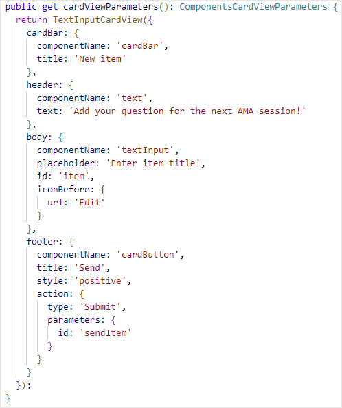
To display the data that you get using the API call in the quick view of the card, use an adaptive card JSON template. To display current user’s direct reports, you can you the template below:
{
  "type": "AdaptiveCard",
  "body": [
    {
      "type": "Container",
      "$data": "${value}",
      "style": "default",
      "bleed": true,
      "items": [
        {
          "type": "TextBlock",
          "text": "${displayName}",
          "wrap": true,
          "weight": "Bolder",
          "size": "Medium"
        },
        {
          "type": "TextBlock",
          "text": "Email: ${userPrincipalName}",
          "isSubtle": true,
          "wrap": true,
          "spacing": "Small",
          "maxLines": 2
        }
      ]
    }
  ],
  "$schema": "http://adaptivecards.io/schemas/adaptive-card.json",
  "version": "1.2"
}
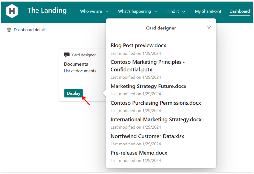
Click on “Apply”, then “Republish” and you can now access dynamic data from the quick view of your Card Designer card:
Conclusion
In this blog post, we covered how to use Viva Connections Card Designer advance API features to get data using Microsoft Graph API and display retrieved data on the card quick view.
 Aimery Thomas' blog